EvidFlow Dashboards
EvidFlow Dashboards
Follow 3 min read · Nov 21, 2025
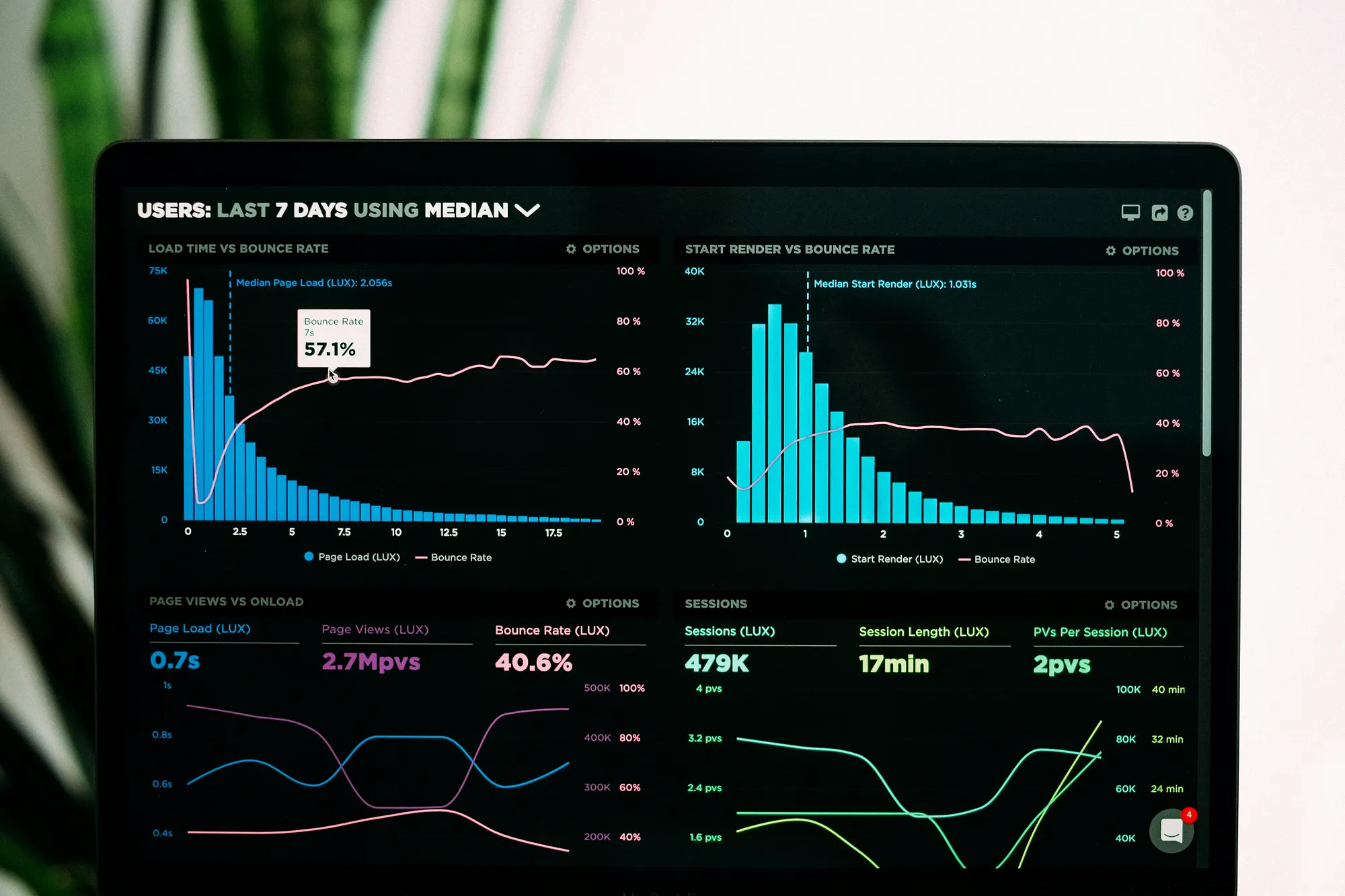
Photo by Luke Chesser on Unsplash
The Intelligent MEAL Command Center for Humanitarian & Development Organizations
Humanitarian and development teams run complex, multi-site, multi-donor projects. Data is collected everywhere; but often remains scattered, under-used, and slow to convert into decisions.
EvidFlow Dashboards bring everything together into a single source of truth.
Built intentionally for MEAL, program teams, and organizational leadership, EvidFlow Dashboards turn raw data into real-time insights that accelerate decision-making, improve compliance, and strengthen accountability to donors and affected populations.
Why Dashboards?
Because organizations need:
A unified view of all projects Real-time visualizations of activities & indicators Automated reporting for donors Clear tracking of progress, bottlenecks, and risks A platform that adapts to every project; from WASH to Protection, Health, FSL, Education, and more EvidFlow delivers all of this through a simple, intuitive dashboard experience.
Key Features
1. Organization-Level Dashboard
The big picture, redesigned for strategic decision-making.a. Multi-project performance overview
b. Beneficiaries reached (total & disaggregated)
c. Geographic coverage heatmaps
d. Funding overview & burn rates
e. Critical risks and upcoming deadlines
f. Cross-cutting indicators (Gender, AGE, Protection, Disability)
Perfect for Executive Directors, Heads of Programs, and MEAL leads.
2. Project Dashboards
Every project gets its own dynamic workspace.a. Real-time activity progress
b. Output and outcome indicator tracking
c. Planned vs achieved graphs
d. Location-based performance maps
e. Donor-specific reporting snapshots
f. Evidence library linked to each indicator (photos, documents, datasets)
Whether it's USAID, ECHO, SIDA, UNICEF, or private donors; the dashboard adapts to compliance requirements automatically.
3. Activity Dashboards
Granular tracking where the work actually happens.Ideal for field teams, cluster reporting, and internal management.
Examples include:
Borehole drilling progress CLTS triggering and verification School attendance and retention Cash distribution cycles Health outreach sessions Protection case management trends Each dashboard includes:
Daily/weekly/monthly activity trends Disaggregated beneficiary numbers Location and facility-level breakdowns Red/Amber/Green status indicators
4. Indicator Dashboards
Finally, a proper, modern Indicator Performance Management System.View all indicators across all projects Compare targets, baselines, midlines, and endlines Visualize trends over time Drill down to disaggregations: sex, age, disability, location, vulnerability Link each indicator to its data source, dataset, and evidence This is the dashboard MEAL Officers and Coordinators have wished existed.
5. Geospatial Dashboards (GIS Mapping)
Turn data into spatial intelligence.Interactive project coverage maps Service and facility mapping Beneficiary density heatmaps Access constraints and flood maps Layer multiple datasets for advanced analysis Powered by Leaflet/Mapbox and optimized for low bandwidth contexts.
6. Custom Dashboards (Build Your Own)
Organizations can design unlimited dashboards with drag-and-drop widgets:KPI cards Bar/line/pie charts Pivot tables Maps Data tables Donor templates Perfect for M&E plans, project reviews, donor reports, and internal briefs.
Additional Enhancements
1. Automated ETL & Data Quality Checks
Dashboards refresh automatically from your Kobo, ODK, Google Forms, and Excel data pipelines.2. Evidence & Document Integration
Click any indicator → view datasets, photos, PDFs, and field reports.3. Shareable Dashboards
View-only links for donorsPublic dashboards for transparency Export as PDF for narrative reporting
4. Smart Alerts & Notifications
Get real-time alerts when:An indicator falls behind A target is exceeded A deadline approaches Data quality issues appear
Designed for Your Entire Organization
For MEAL Teams: Automated indicators, disaggregation, dashboards, reports.
For Program Teams: Clear tracking of activities and monthly progress.
For Leadership: High-level snapshots for strategic decision-making.
For Donors: Consistent, accurate reporting, every time.
The Result?
A MEAL system that is:
Faster More accurate Donor-compliant Transparent Automated Organization-wide EvidFlow Dashboards transform the way NGOs measure results, communicate impact, and make decisions.
Written by EvidFlow 1 follower · 4 following Complete Smart MEAL Platform Built for NGOs. From beneficiary databases to smart reporting, our integrated platform covers every aspect of your MEAL needs.